
De Zuidduinen
A beach campsite in Katwijk that was ready for a new generation. Less old-fashioned campsite look, more sea, nature and life between the dunes and the beach.
- Client
- De Zuidduinen
- Location
- Katwijk
- Year
- 2020 – present
- @strandcampingzuidduinen
Challenge
The existing identity felt dated and no longer matched the direction De Zuidduinen wanted to go in. The brand had to become fresher and younger, without losing the character of the place.
Creative direction
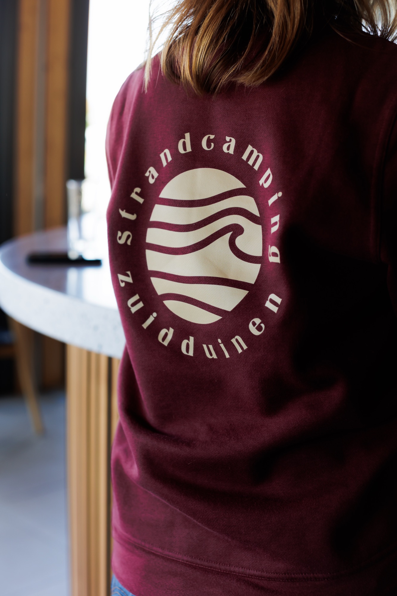
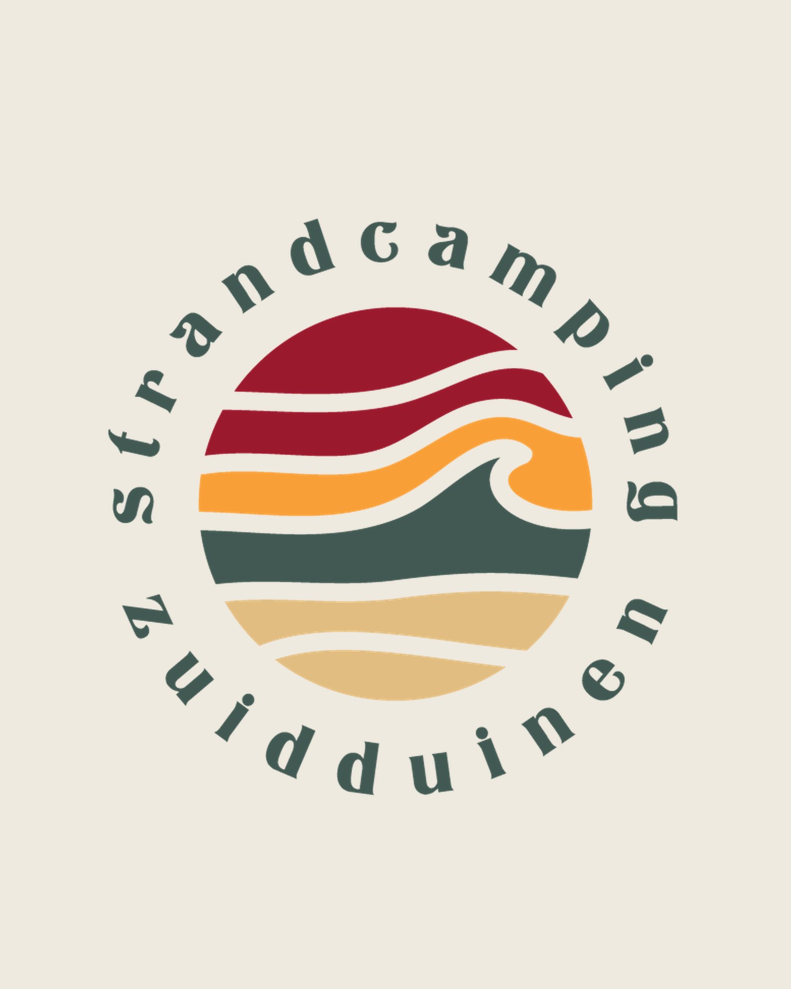
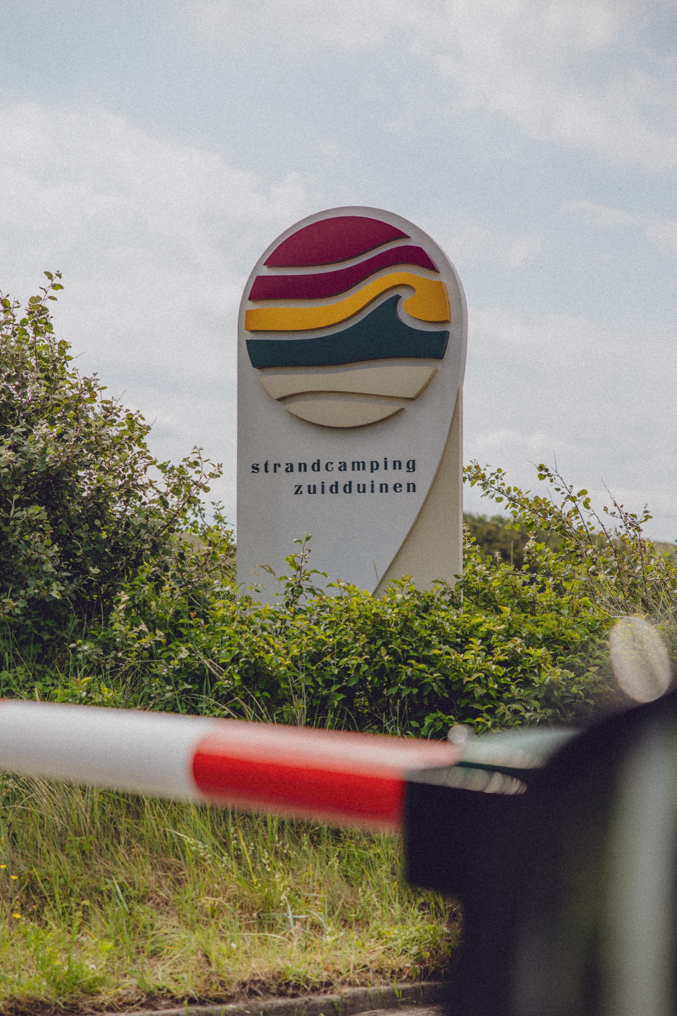
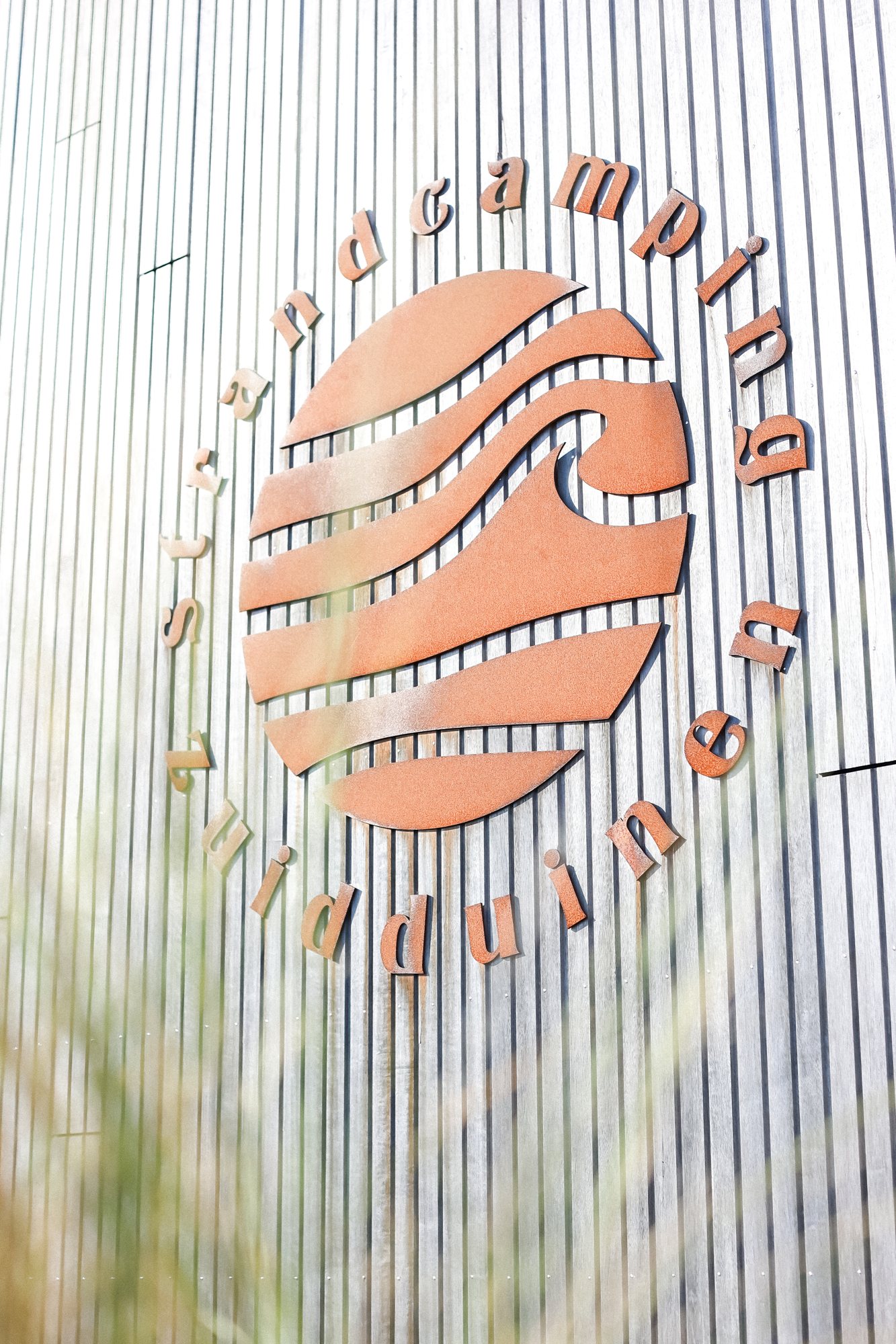
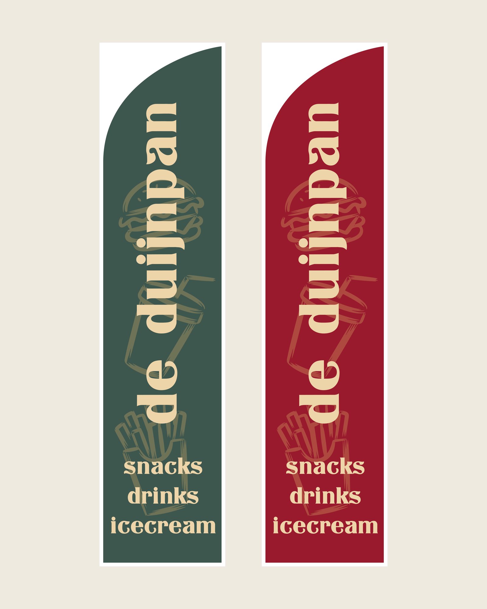
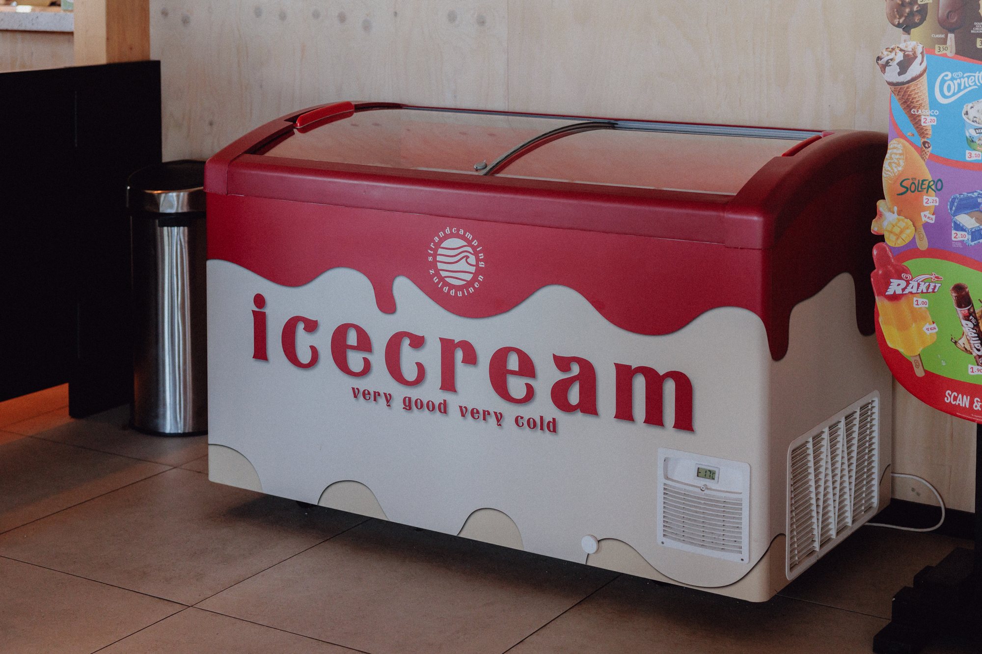
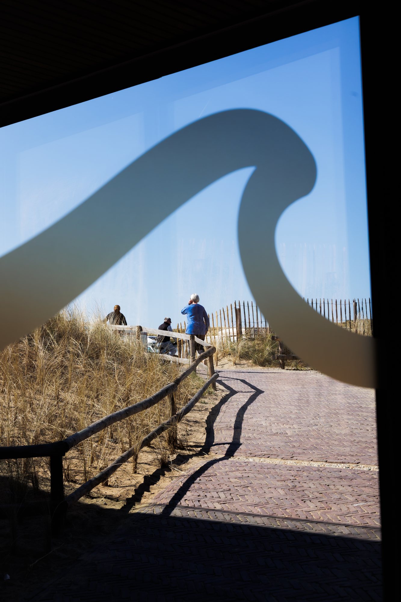
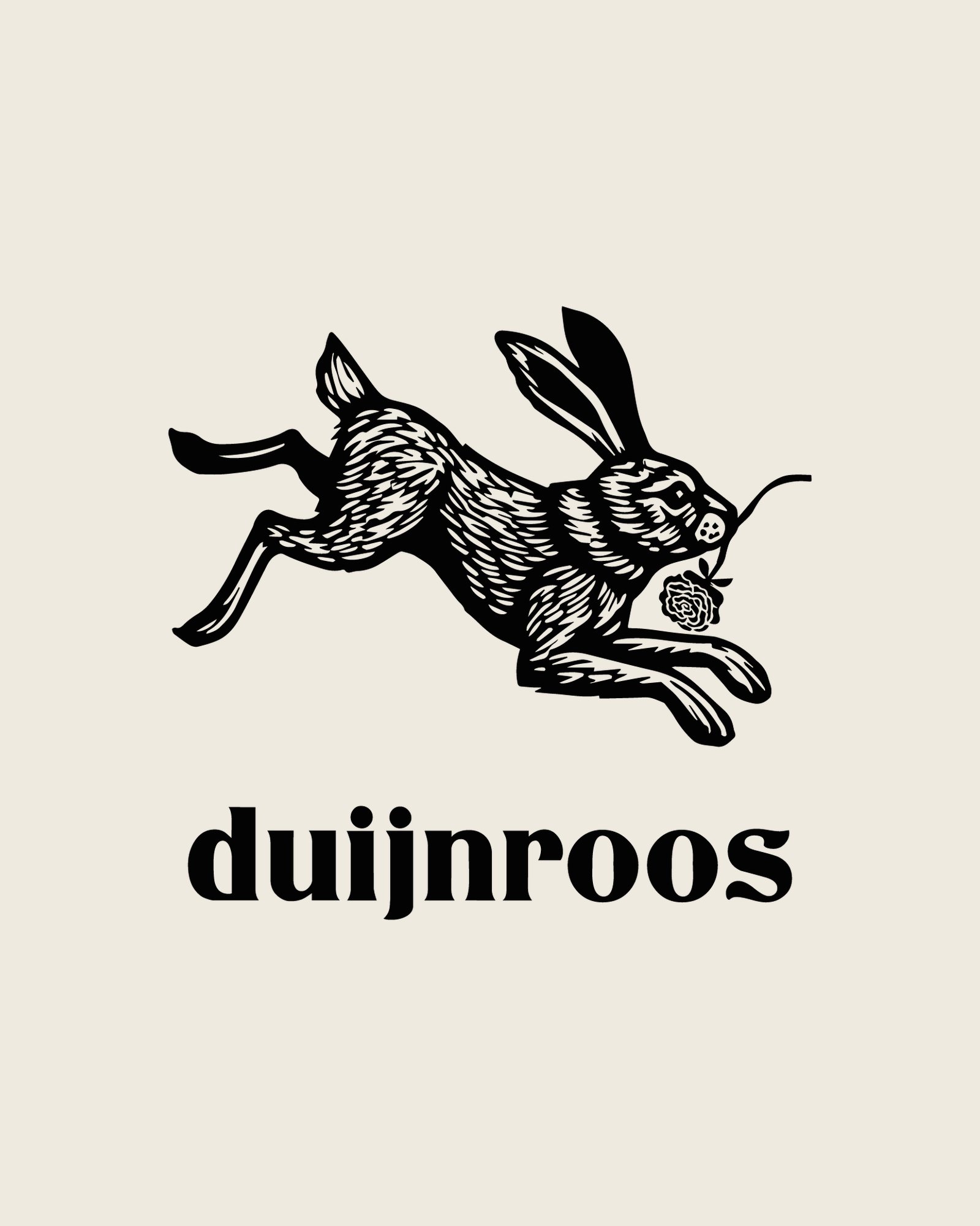
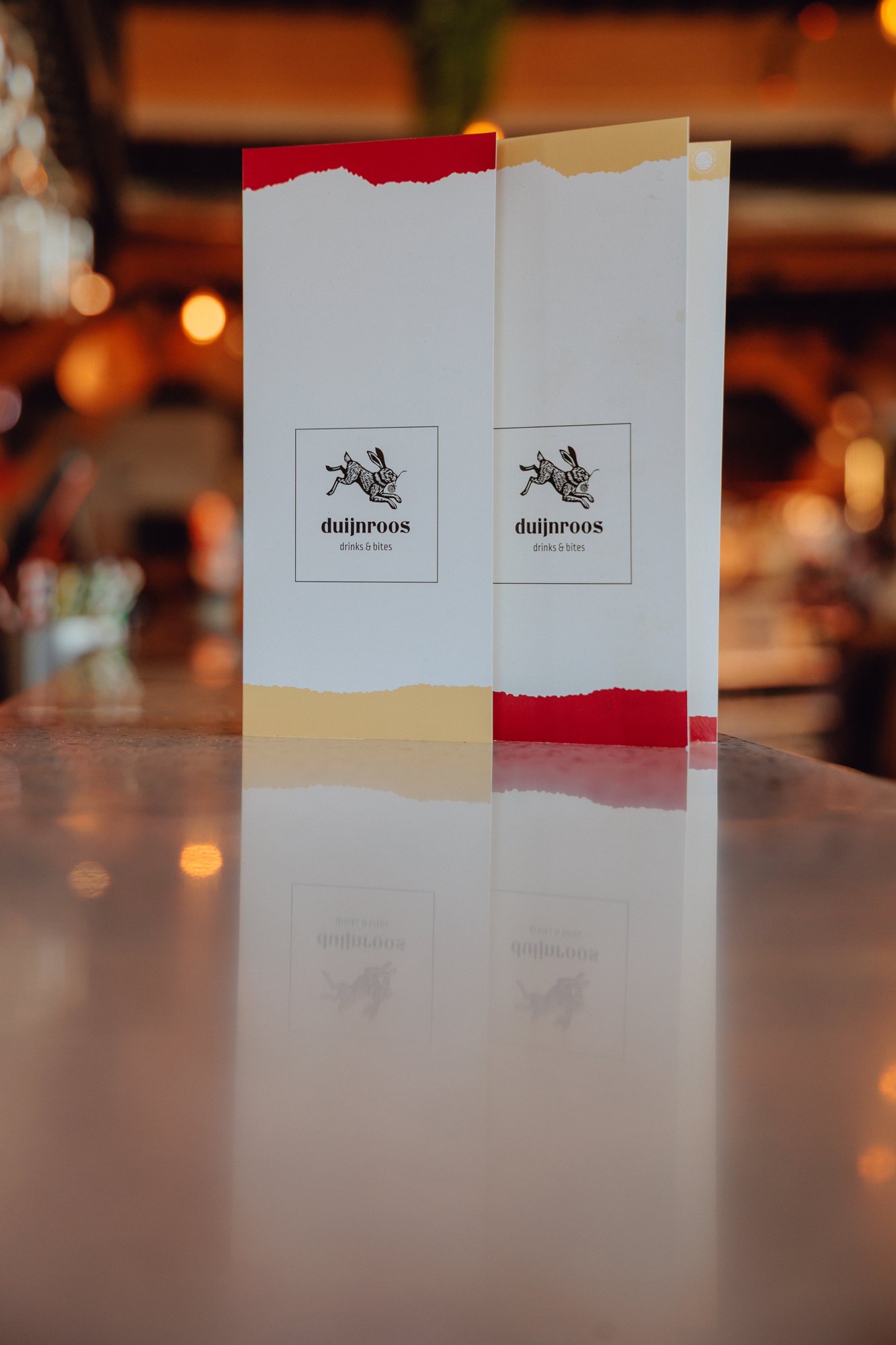
The surroundings became the starting point. A mark taken from the sea, colours from the sunset and the dunes and beach as the connecting layer. Natural and relaxed, without turning it into a standard surf brand. Then we carried it across the whole site: flags, the windows, the ice cream cart and the snack cart. For the restaurant at the campsite, Duijnroos, we made its own identity that belongs with the campsite but can stand on its own.
What we made
- Identity
- Logo and mark
- Colour palette
- Identity for restaurant Duijnroos
- Flags
- Graphics for ice cream cart, snack cart and windows
- Design and print
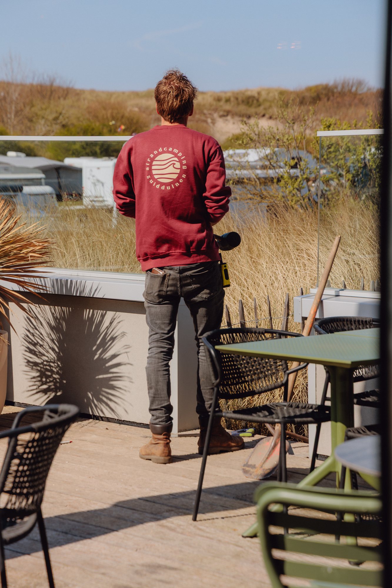
- Merchandise
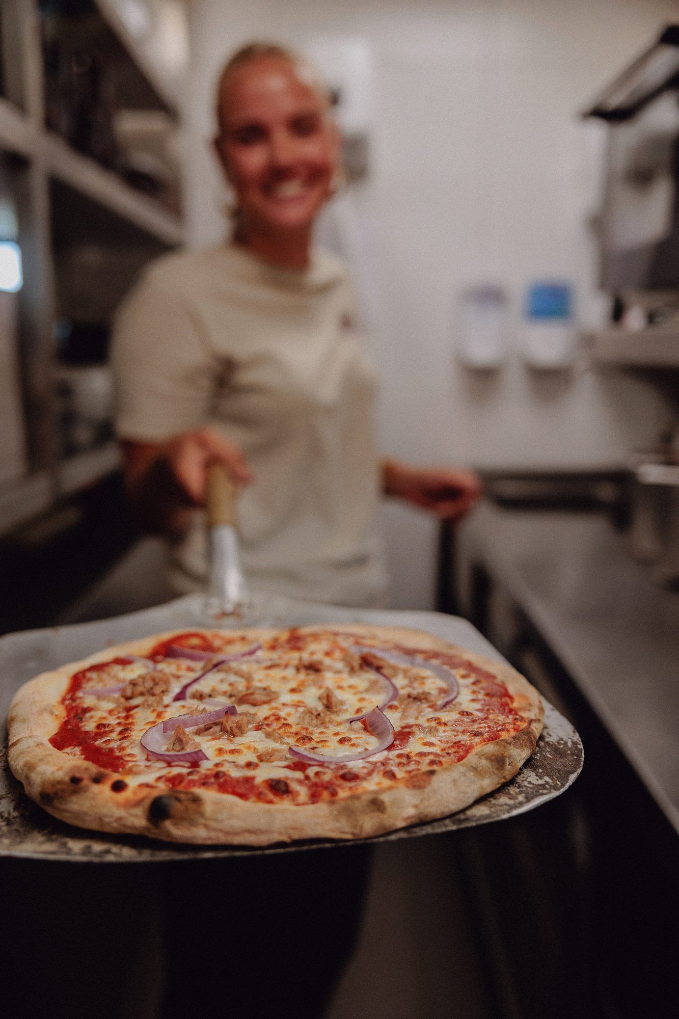
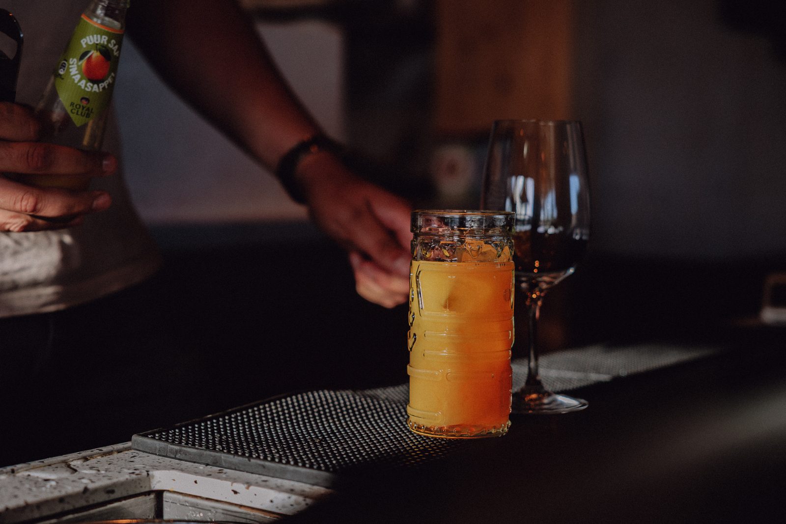
- Photography and video
Working with Lars is a joy. He has been doing the graphic design, including imagery, for Strandcamping Zuidduinen for over two years, and he still manages to surprise us every time with creative designs that fit exactly what we want to put across.